adjective
1. of superior quality, more desirable, satisfactory, or effective.
noun
2. the better one; that which is better.
verb
3. improve on or surpass (an existing or previous level)
The political campaign of elected representative for Anguilla' District One, Palmavon "Pam" Webster, reached out to us to help them launch their re-election campaign. They needed to create brand assets quickly to have a successful launch and set her up for re-election with the 2020 elections approaching.
Art Direction
Brand Design
Brand Strategy
Copywriting
Creative Direction
Photography
Print Design
Social Media Design
UI/UX Design
Videography
Web Development
Our challenge was to address the need for Pam Webster's campaign to elevate their candidate, and create a platform to effectively reach her constituents, regardless of how they consumed media.
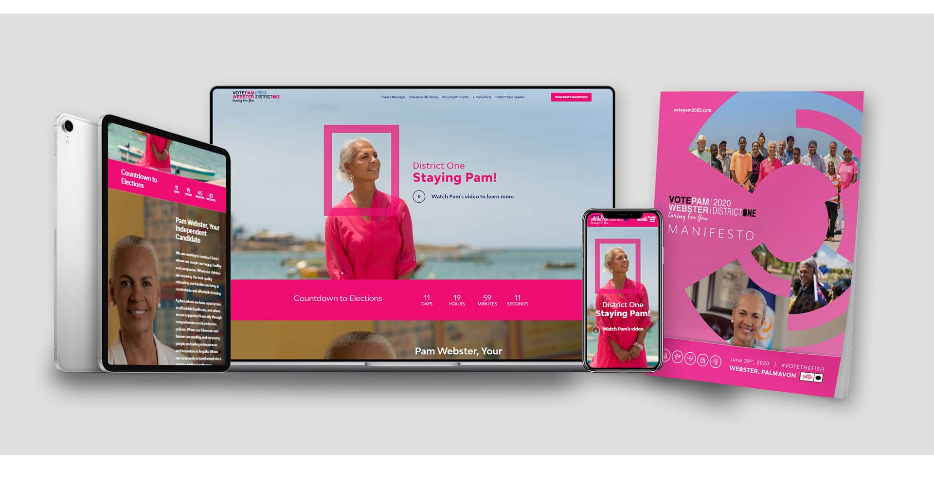
Over the next few months, we were able to have not only a successful campaign launch, but we were able to create a memorable brand, as well as integrated campaign, with digital, print assets as well as a unique website. Complicating our work was the start of the pandemic in Anguilla. The island had its first confirmed cases on March 17, barely a month after the campaign launch forcing us to shift to an all remote collaboration.
We continued to work with the campaign post-launch, and through the onset of the COVID-19 pandemic to iterate on the brand, create a full suite of brand and campaign materials including photography, digital and print assets, all her campaign videos as well as her messaging from the start of the campaign right up until election day on June 29.
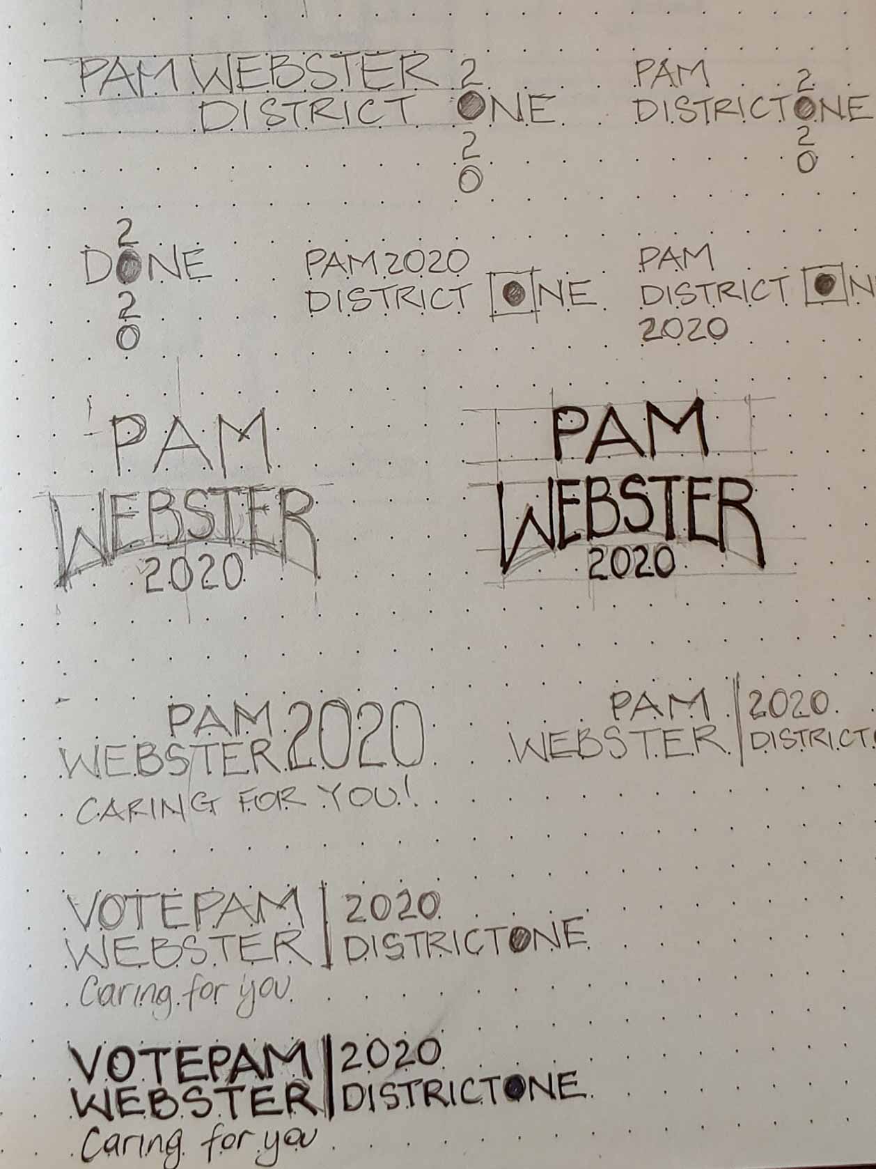
We began working with the campaign just a week prior to the campaign's launch, With few brand assets available, and no clear brand image for Pam, we had to employ a fast creative process in close collaboration with the campaign team.
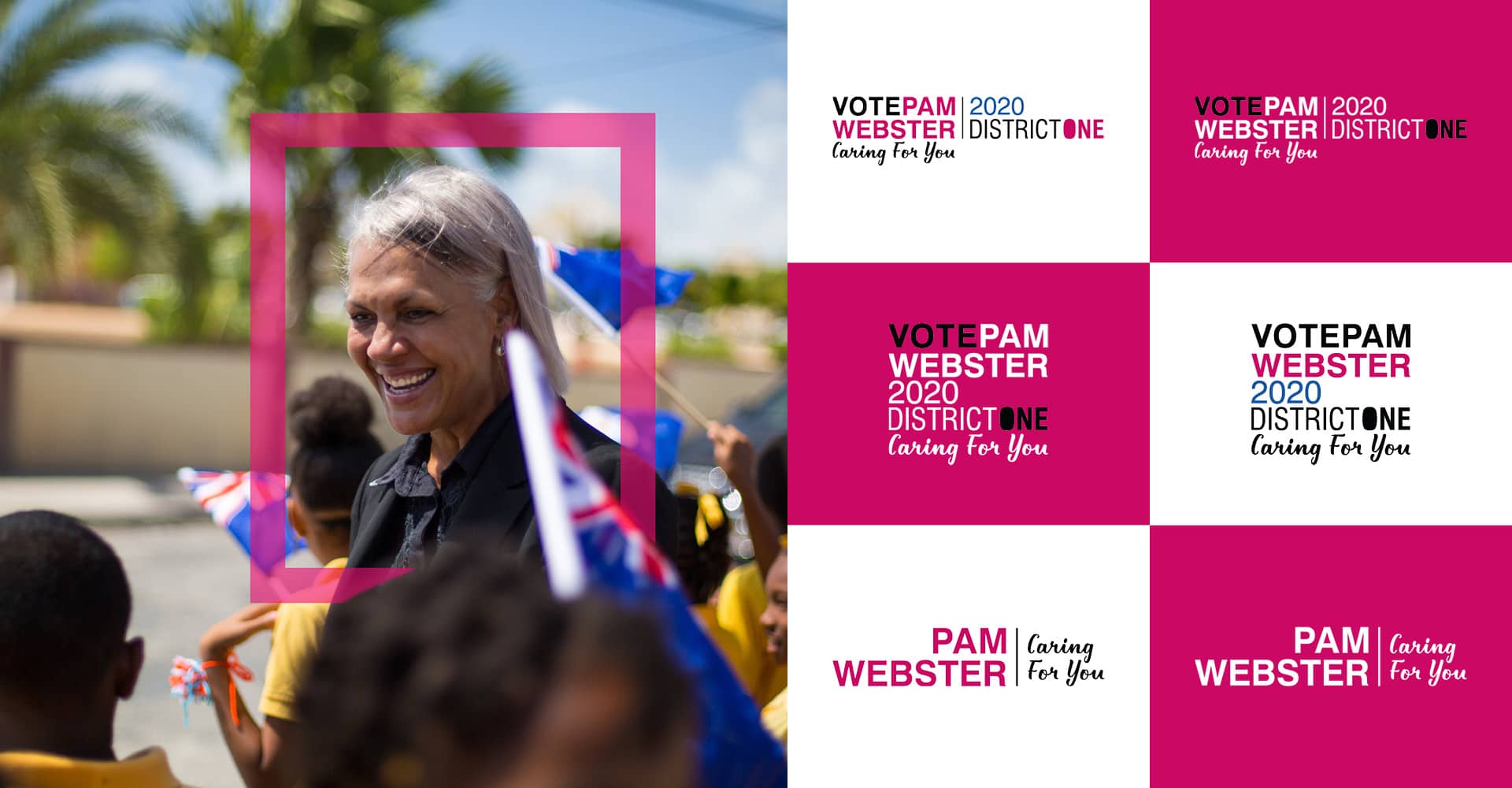
We felt that since she was an independent, female candidate, her brand needed to project strength, while still preserving her reputation of being empathetic and intimately connected to the people in her district.
We developed a number of logo lock-ups, building on her legacy colours of pink and white, but adding a strong navy blue accent to anchor the design. We also created a more humanist version of the logo, to be used in her community and non-profit work. It dropped the voting and electoral district references, to communicate a very simple message: Pam Webster, Caring For You.The Branding Process
A month before the elections, we launched her campaign website, and manifesto. It sought to portray her as strong and competent, while being approachable and down-to-earth. We also developed and focused on messaging to reinforce the idea that she had the support of the people.

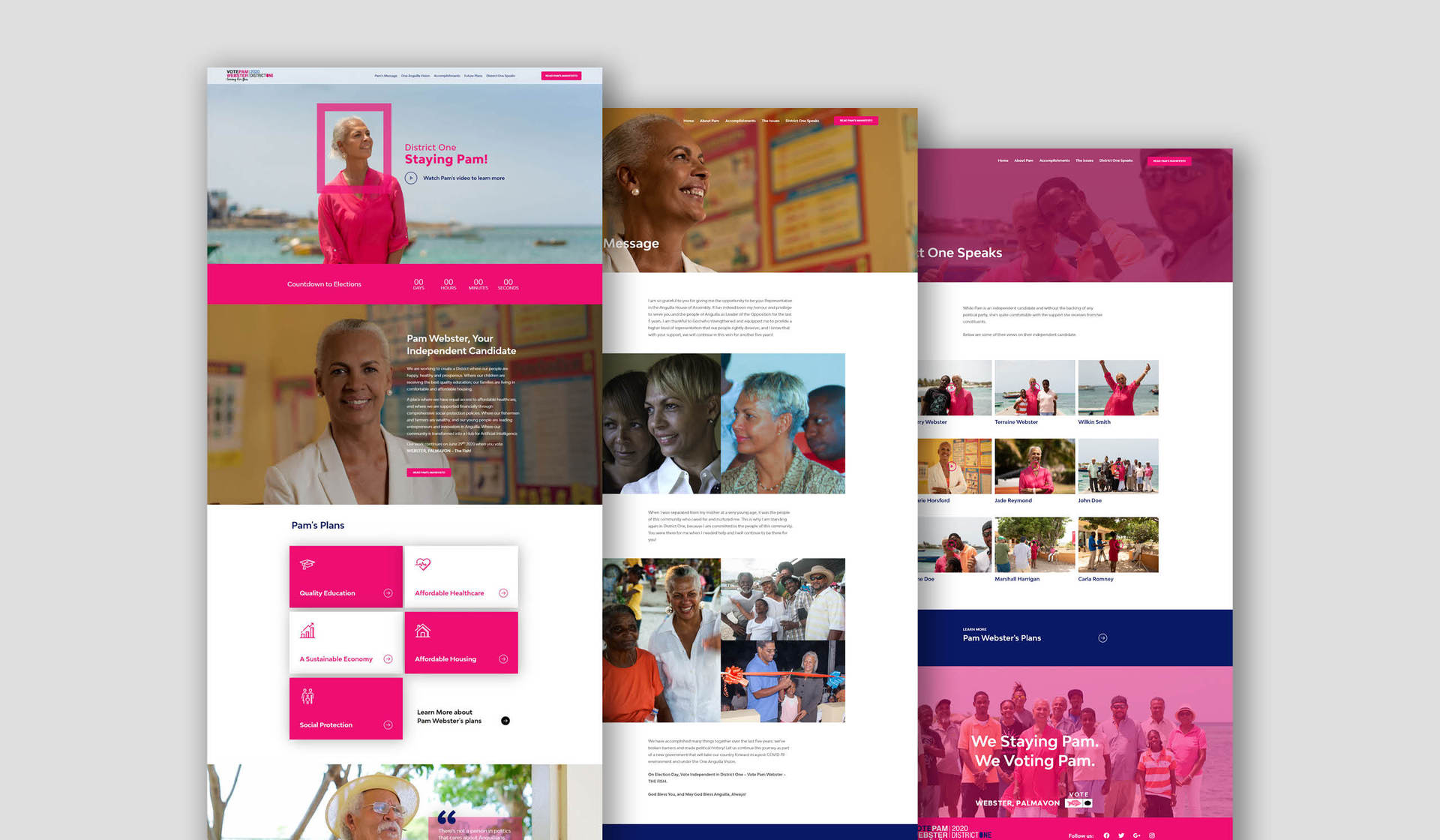
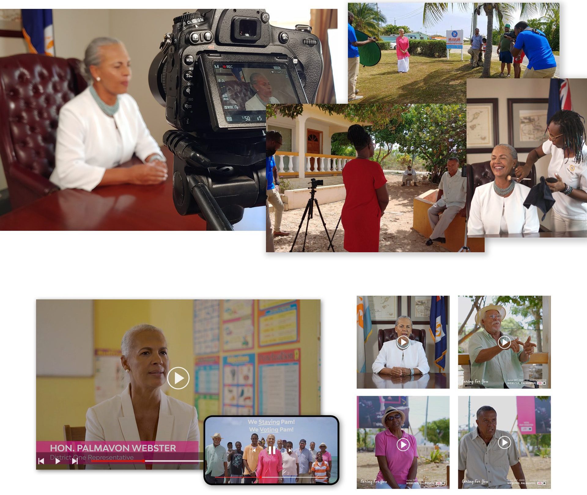
We collaborated with K-Sharp Media to create all new photography as well as videography that we used in her digital marketing for the remainder of the campaign.
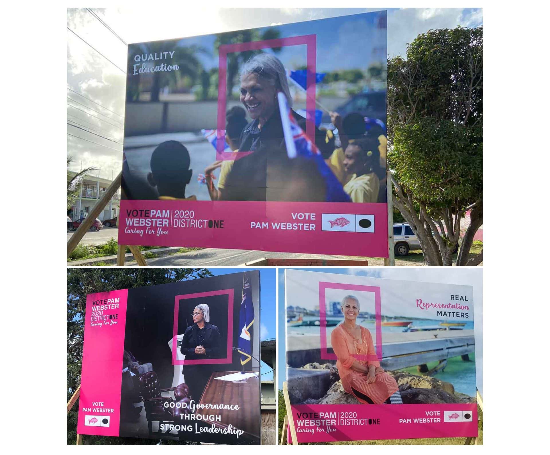
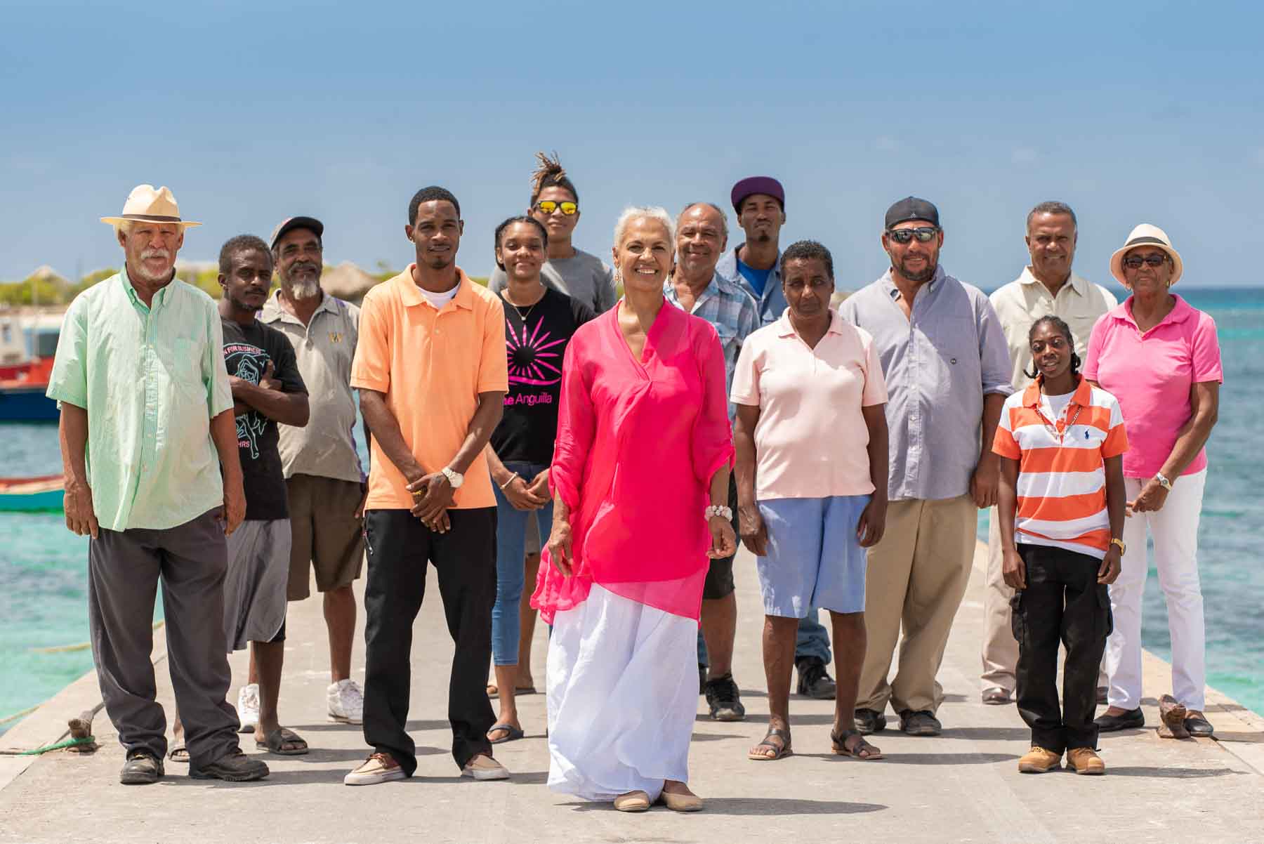
As the campaign progressed, we thought to emphasize the fact that though she was an independent candidate, without the backing of a large political apparatus, she had the support of the people.
We coined the phrase "independent, but not alone" to be a guide for our design and messaging efforts. We drew inspiration from the art of early 20th century workers movements that rallied around strong, charismatic leaders who led with a focus on the people. In the lead up to the elections, we made sure all her visual media incorporated her with a group of her constituents reinforcing our messaging.
Over the course of our engagement we produced the following deliverables: campaign flyers and billboards; social media strategy and design; t-shirts; campaign photography and videography; website and print/digital manifesto.